radiosphere by FluxFM

radiosphere
by FluxFM

UI Design,Icon Set, Prototyping

2022

Role

UI Designer

Expertise

CMS Icon Set

Year

2023

Sample project image

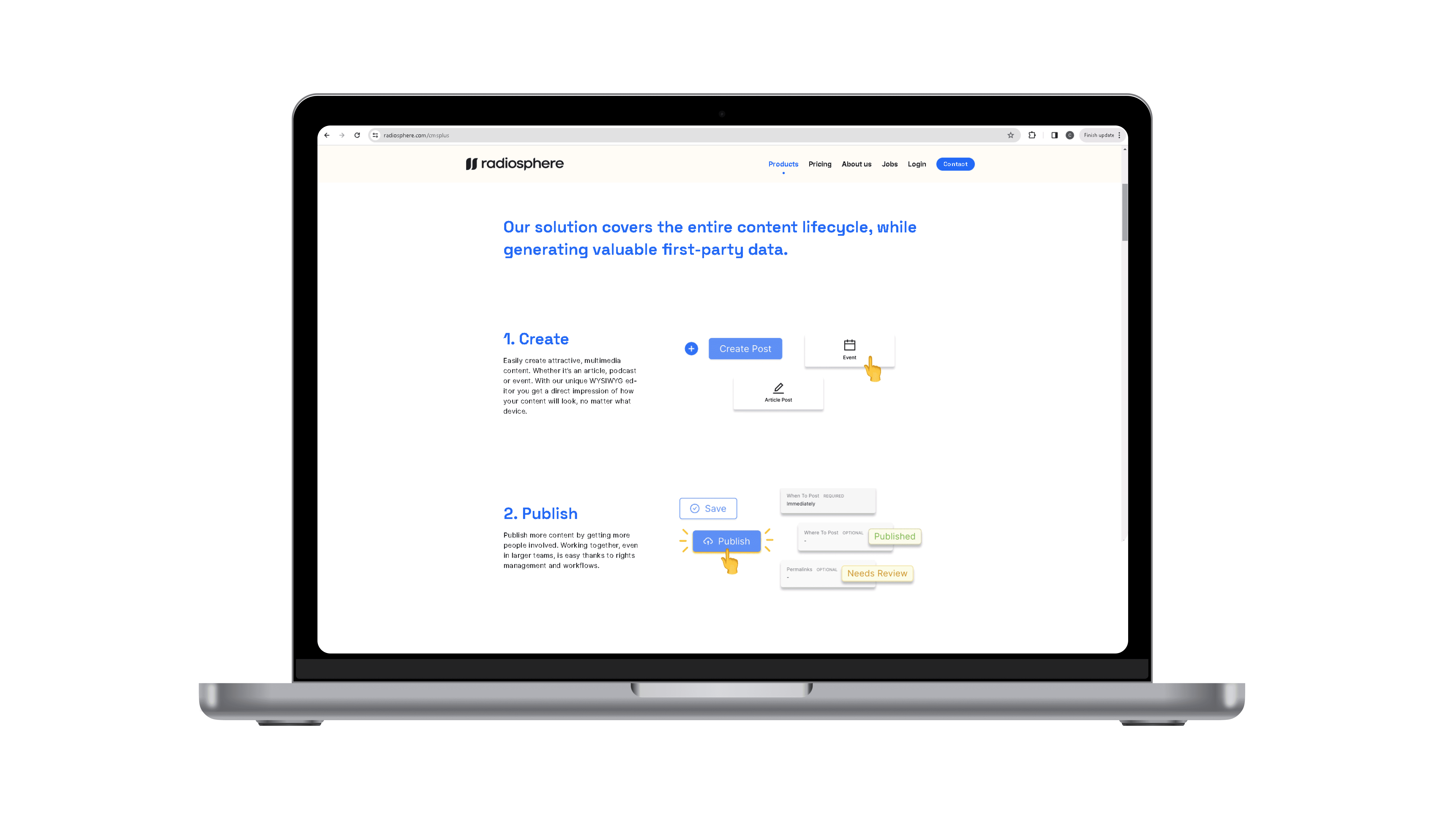
Radiosphere is a Berlin-based start-up offering CMS+, Audio-Centered Websites and Apps, Digital Radio Streaming services. It was founded by FluxFM and is used by many radio channels.

The Problem

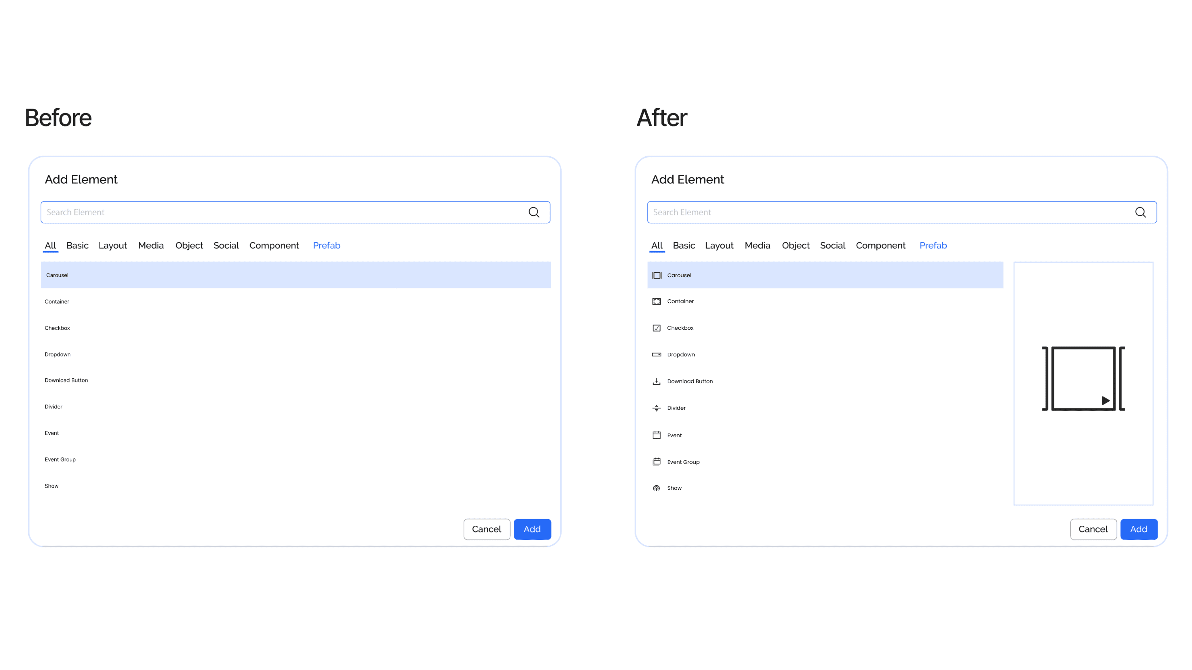
Users getting difficulties in finding desired components for their website/app via the WYSIWYG CMS, leading to a decrease in user navigation satisfaction and overall experience.

Proposed Solution

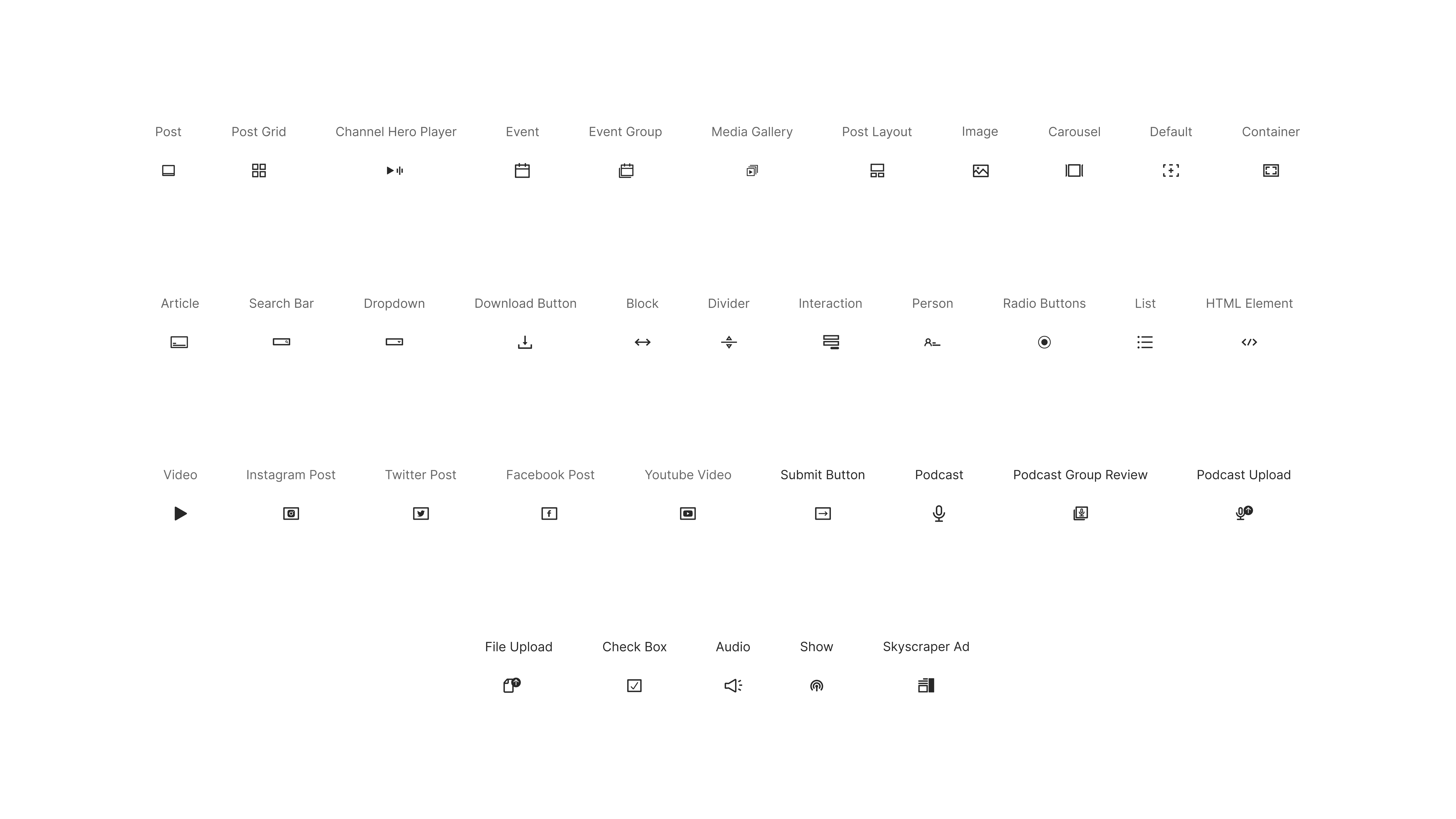
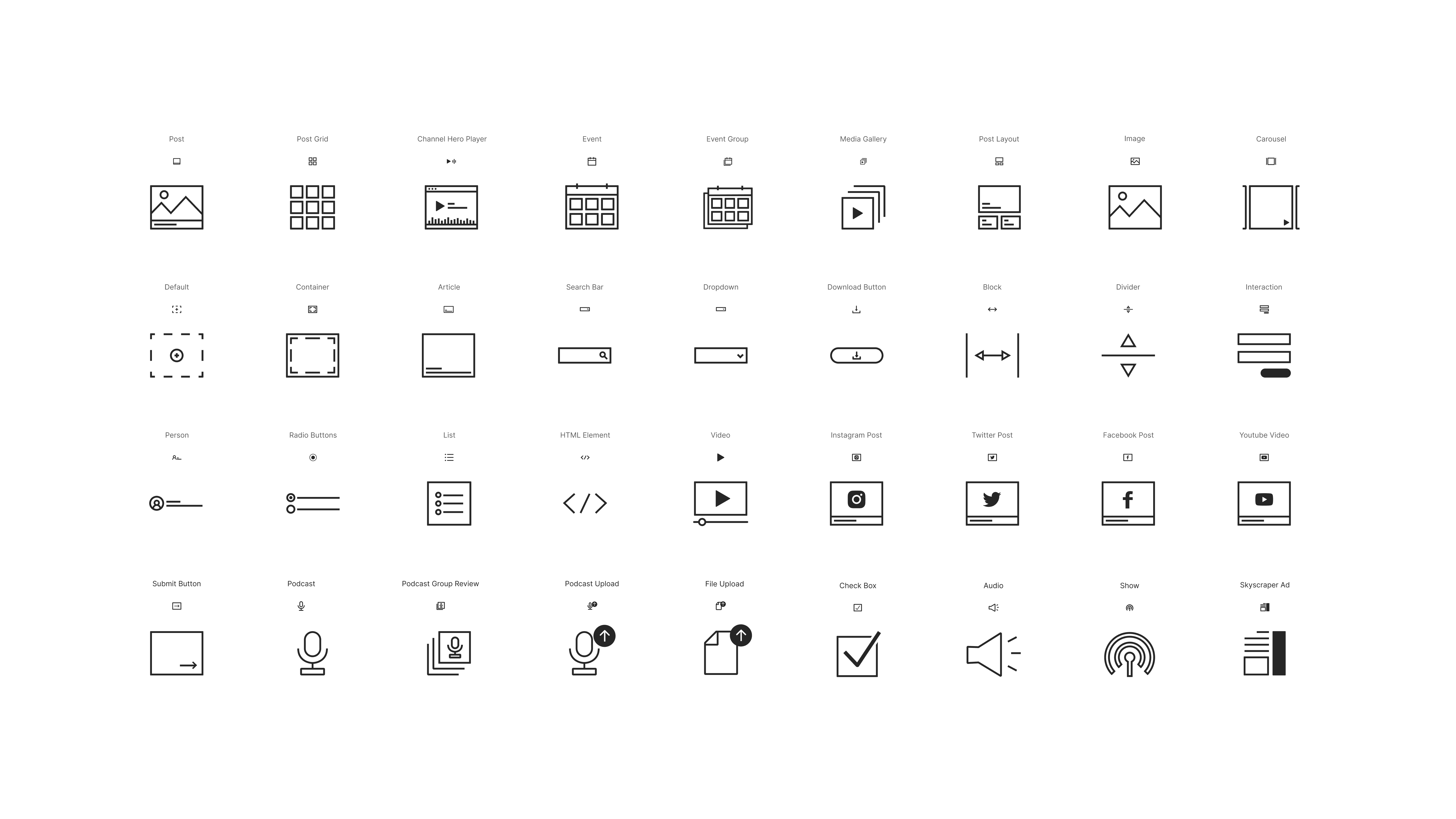
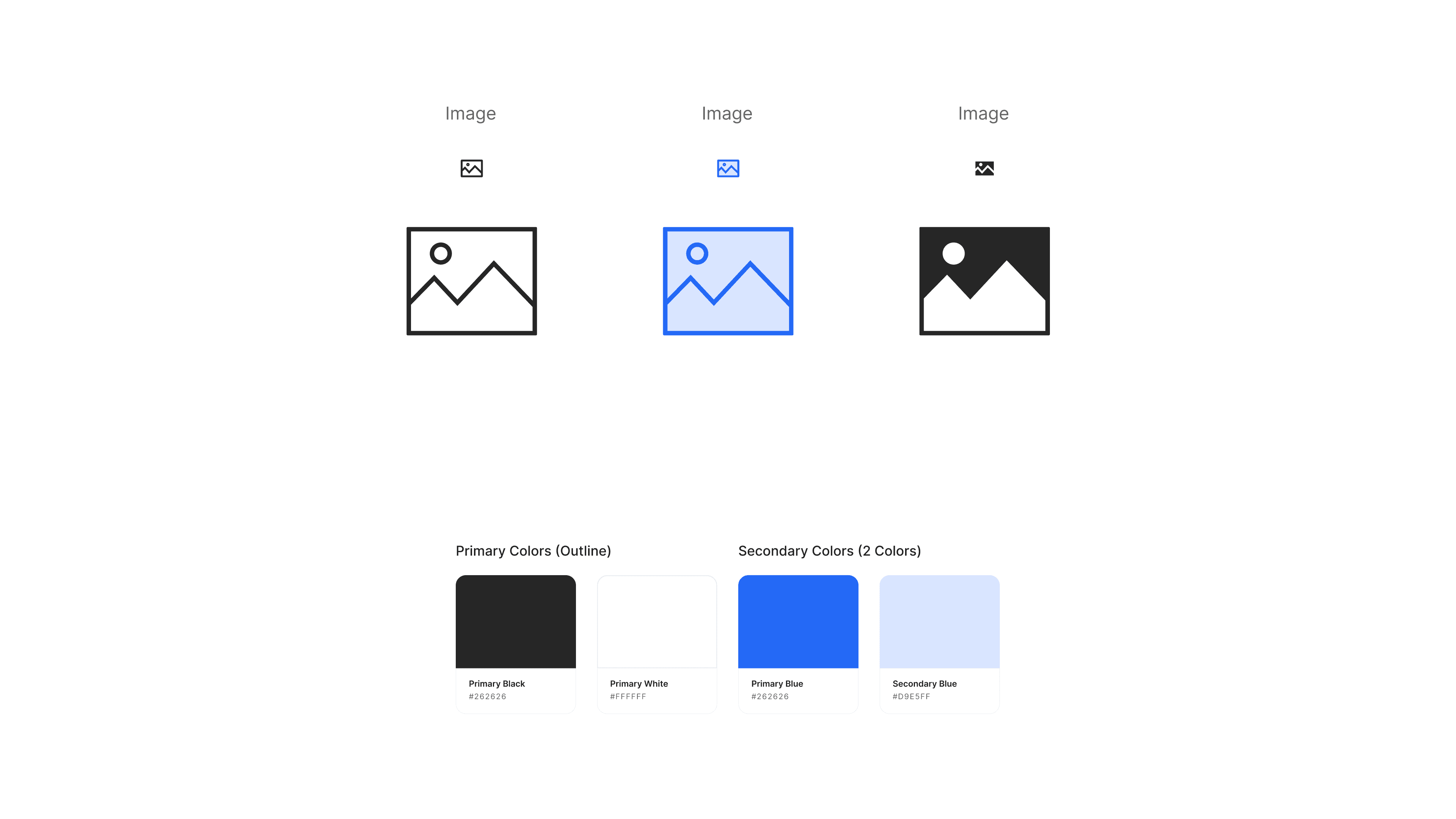
I optimized user navigation and visual appeal in their CMS by designing a comprehensive icon set for the component-adding section, simplifying component identification and accessibility. To enhance usability, I created small icons for quick identification and larger icons that appear when a component is selected for better understanding. Additionally, I designed two-color versions of the icons and ensured compatibility with both light and dark mode interfaces, providing a consistent and user-friendly experience across all settings.

Sample project image

1.Discovery

1.Discovery

1.Discovery

1.1 Introduction

Reported by clients, including Antenne 1 and Flux FM who expressed difficulties in locating specific component elements for their streaming website. This project was motivated by the feedback received from clients, indicating a notable gap in user satisfaction and efficiency when it came to navigating the platform to add desired components.

  • Antenne 1 /Radiosphere's client
    “We spend more time searching for components than actually adding them.”

  • FluxFM /Radiosphere's client
    “I wish there was a simpler way to identify and select components for Flux FM.”

2.Design Guidelines

2.Design Guidelines

2.Design Guidelines

2.1 Colors

Sample project image

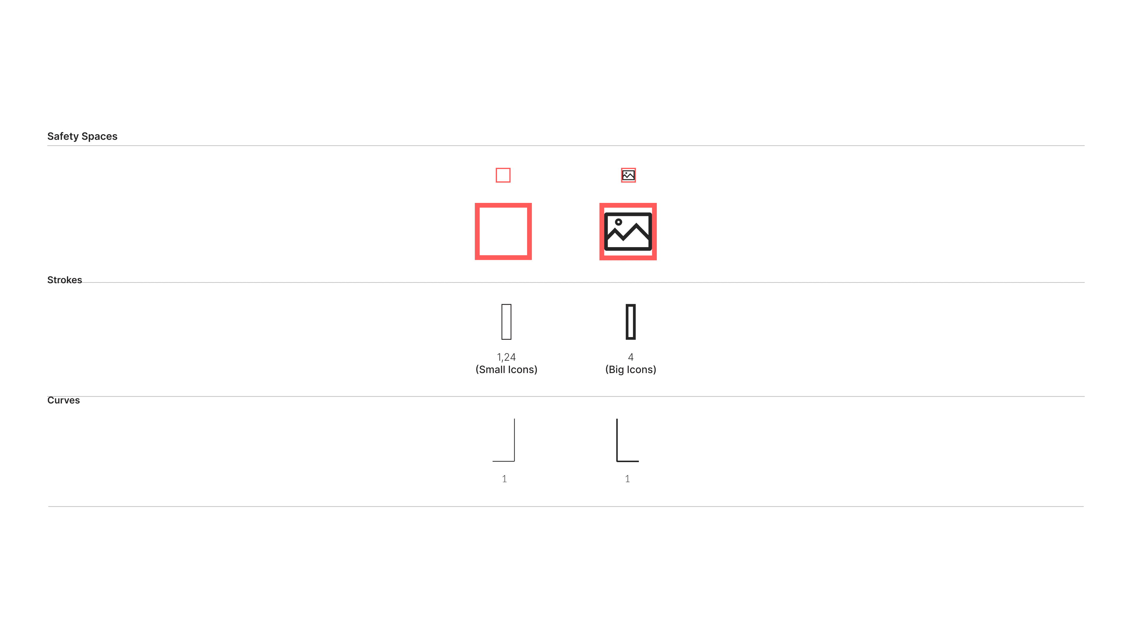
2.2 Spaces and Guideliness

Sample project image

3.Outcomes

3.Outcomes

3.Outcomes

The newly designed icon set introduced small preview icons for quick identification and larger detailed icons that appear upon selection. This dual approach allowed users to preview components efficiently and access detailed explanations when needed, significantly improving navigation and understanding within Radiosphere's CMS. The design ensured a seamless and intuitive experience, fostering greater satisfaction and productivity.

3.1 Small Icons

Sample project image

3.2 Big Icons

Sample project image

3.1 Small Icons

3.2 Big Icons